PROJECTS
Barnhouse

OVERVIEW / 01
Evolving a familiar identity without losing what made it distinctive.
Established in 1992, Barnhouse Veterinary Surgery is a fully independent practice specialising in the care and treatment of companion animals.
Barnhouse initially approached Arca to explore a complete rebrand. However, after reviewing the existing identity and understanding the practice's history, it became clear that much of its character and recognition was worth preserving.
Rather than starting again, Arca recommended a considered evolution of the existing brand, modernising its appearance and improving its versatility while retaining the identity clients had come to recognise over many years.

PROBLEM / 02
A recognisable brand that needed to work harder.
At the heart of Barnhouse's identity was a distinctive hand-painted barn owl illustration that had become closely associated with the practice.
While the artwork had served the business well, it was no longer practical for the range of applications required of a modern brand. Its original format limited how consistently and effectively it could be reproduced across signage, stationery and digital platforms.
The challenge was to improve the identity's functionality and presentation without losing the familiarity and individuality that made Barnhouse recognisable.
A complete rebrand risked moving away from an established visual identity that already held value with its clients. The opportunity was to build on what existed, rather than replace it.

SOLUTION / 03
A thoughtful brand evolution, built around what already worked.
The project focused on retaining the distinctive elements of Barnhouse's existing identity while creating a more practical and consistent visual system.
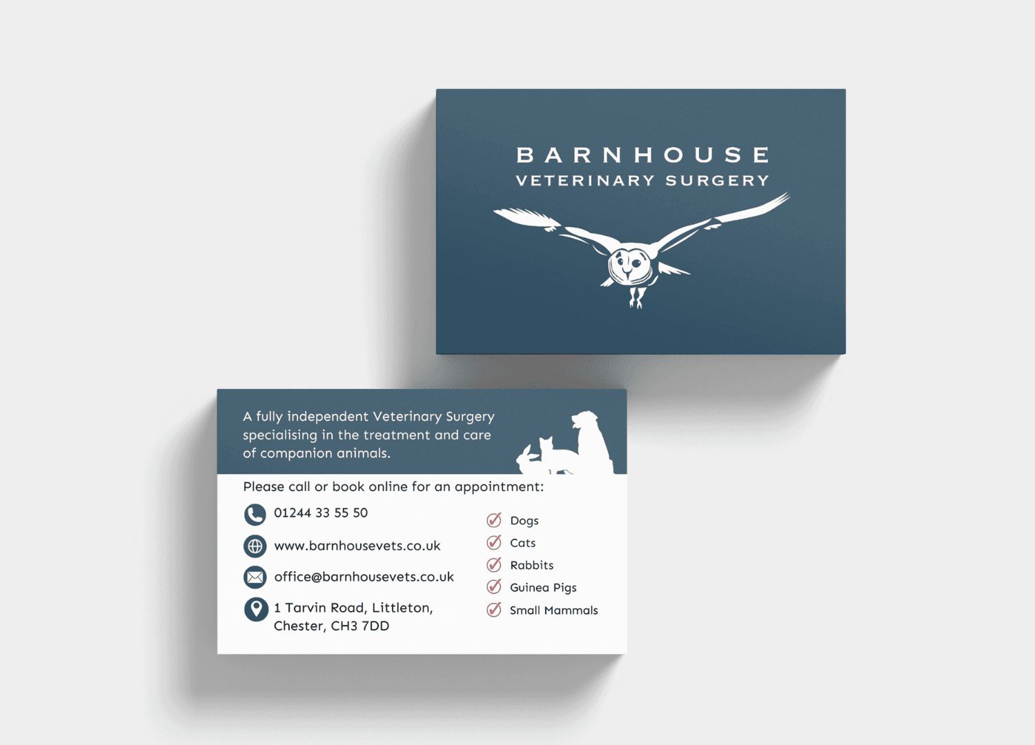
The original barn owl illustration was carefully redrawn as a clean vector graphic, preserving its recognisable character while allowing it to be reproduced clearly across different sizes and applications.
A complementary typographic identity and refreshed visual direction were developed around the owl, bringing greater consistency to how the brand appeared across print and digital materials.
The updated identity was applied across stationery and supporting business materials, with final artwork prepared for the practice's new signage and supplied to the signage company for production. Brand guidelines were also developed to ensure the identity could be used consistently in the future.
The result is a more refined and versatile identity that feels familiar to existing clients while giving Barnhouse a professional, practical brand system for the future.

Testimonials
04
Frequently Asked Questions
FAQ / 05
What kind of businesses do you work with?
I work with independent and growing businesses, as well as established companies that care about how they're presented and want to move their business forward. The best projects come from working with people who value good ideas, thoughtful design and a considered approach.
